Erik´s Designwork
Friday, August 23, 2013
Monday, August 19, 2013
Wednesday, July 31, 2013
Wednesday, June 26, 2013
Hai there, new things
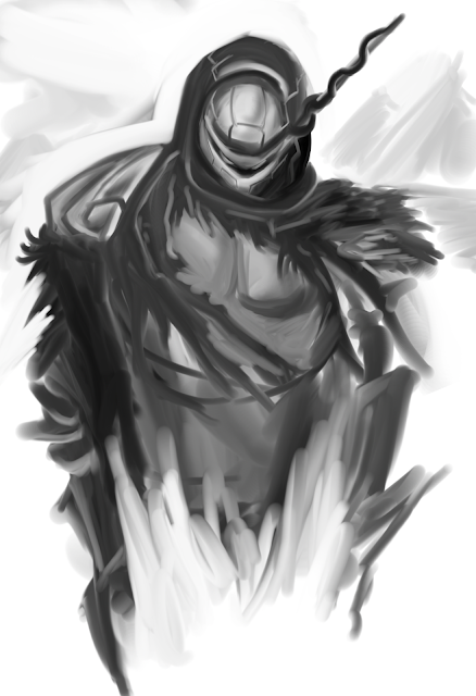
Some good old b/w sketches. I don't even know why i'm so scared of colors. Probably because i'm not so good at them.
Monday, June 10, 2013
Sketchez and Evelyn Redesign
I feel like...bad and shit for not posting more often.
Weird sketches and designs.
Documented the process of how an character gets made.
This looks more like new york or something and not like california at all. And this weird twist between her upper and lower body....I'm aware of it but i couldn't change it without redrawing the whole thing. There is always a next time!
Thursday, May 30, 2013
Wednesday, May 29, 2013
Wip Shit
Quick composition sketch:
Work in progress:
The camera angle makes it more dynamic, but i will draw and colorize it first like that and then tilt it. Her pose might seem a little weird, but i think it's ok like that.
I think the bg needs more of the emotions in it. Like what's the character all about and stuff.
Monday, May 27, 2013
Akthof
Akthof today. We had quickposes which kinda overwhelmed me at first. Here are some pics i took with my cam, since they are too big for the scanner.
I'm soooo proud of them. Look at how good they are. (Fuck i need to improve -.-)
Tuesday, May 7, 2013
New Stuff!
Here's some sketch and the finished (?) version of a character design. Evelyn and her dawg. Can't say i'm happy with the final result.
Here is some thing i drew while talking with a good friend on skype about philosophical themes, business, getting rich and stuff. Might be interesting for psychoanalysis or something like that lol.
Sunday, April 28, 2013
Evening sketching, sketchez
Hai, i forgot the scan settings to scan it without everything looking like shit, but anyway. Here's some Cafe' evening sketching masterpiece.
And more digital sketches.
Monday, April 1, 2013
Weekend pussy hunt Duh....
I don't know what to write. Here is a design study of a weekend pussy hunt drawing. Gonna try to do these every day (with drawings that impress me).
Here is the original screencaped:
Thursday, March 28, 2013
The Balance of Shapes
Today there was some alright progress. I learned a lot on the topic of design, shapes, and their balance.
First i traced a drawing, which i thought has good design and then i tried to draw it myself. With the many obvious mistakes i also did learn a lot.
Worked some more on art of my graphic novel. This character is the manifestation of ego and the japanese on her katana reads "Black Panther".
Buddha head asset i did for project Kunoichi:
Scribbles:
Saturday, March 23, 2013
Cold war - Sushi and Cafe'
Had some cafe' sketching with Shannon and Flo! I never really tried capturing the movements of people on the street (as seen from the cafe') but in the end, you add a lot from your imagination
Very Early sketch following, but i have nothing else to show.
Thursday, March 21, 2013
Epiphany time
I think i really have to figure out what i like when it comes to the art-style i pursue and the general direction of my career.
It's always a good idea to take look back at your childhood, because there you will probably find the reason you wanted to do art in the first place.
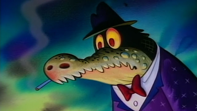
The cartoon from my childhood i most vividly remember is Ren & Stimpy. Back then, when i was 6 years old or so i watched it on Nickelodeon and i just couldn't believe how funny it was. Everything was designed to be funny, it was straight to the point. It stood out from the other Nickelodeon cartoons like Doug or Rugrats, i could see that even as a small kid.
Yeah, Ren & Stimpy influenced me a lot and it had a great impact on my aesthetic feel when it comes to art.
I realized that just today, when i was watching one episode casually. It was a games animation episode though, but still great. Especially the paintings, wow. I had to screencap those. (copyright viacom i guess)
Childhood feels right there.
Also realized that not all characters need to be nice looking and model-like. Take Wario for example. What a great character, i always wanted to do an fanart for Warioland 4 (also childhood game). Gonna tackle that soon.
Anyway, onto something different.
So my graphic novel is ever changing and shapeshifting. I definetely settled for the setting: A Starbucks cafe'. Evelyn gets to fight some hipsters there. One of them needs to be french! Here are some horrible scribbles i did.
Need to find some cool designs for the hipsters. They need to look ridiculous.
Subscribe to:
Comments (Atom)


